

Contrary to what it may seem, Negative Space isn’t something we should run away from. It is, actually, a key concept to good design – what makes the difference between chaos and order, being able to grab someone’s attention, or lose it completely.
Negative space is the empty space surrounding the object by which it is defined. It’s the space that allows us to “breathe” and that focuses our attention on what really matters. We leave the unnecessary behind, get rid of the chaos, and what remains is what is important. In general, the human eye is attracted to design with negative space, seeing as in these cases processing information is much easier, making them much more pleasing to appreciate.

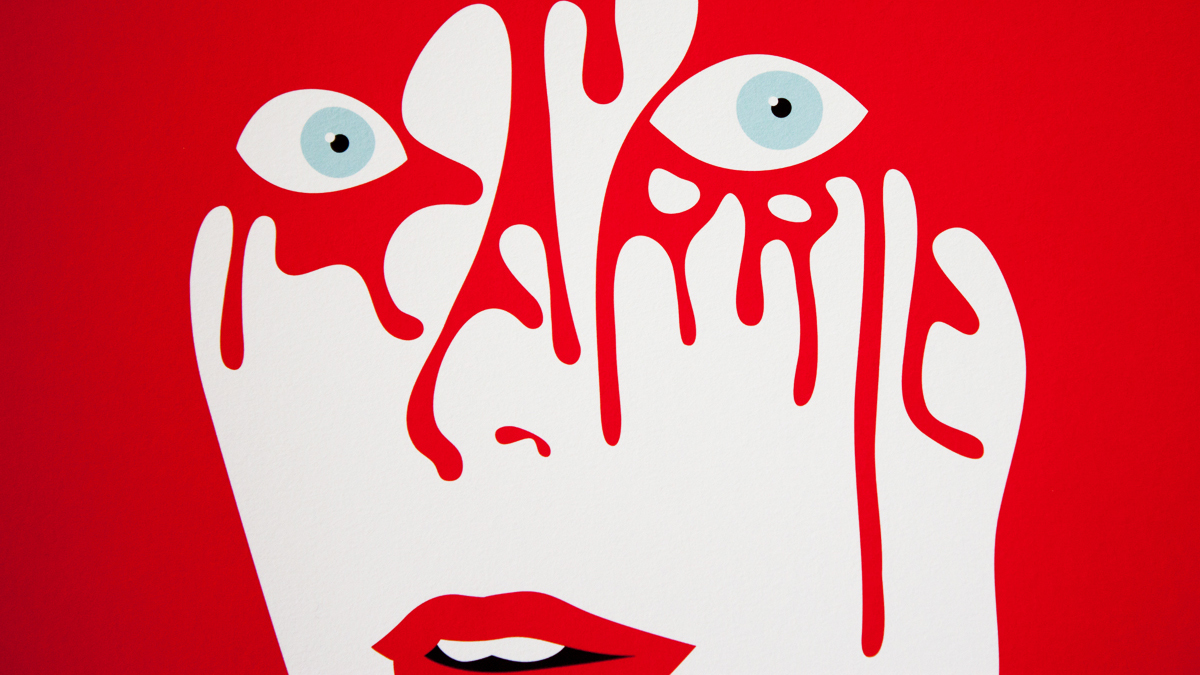
In this case, the illustration was made by the french artist Malika Favre, for Sephora, a brand that sells perfumes and cosmetics. The artist took advantage of the negative space to showcase the elegance that speaks so much for the Sephora brand, as well as the colors that were used.

The minimalism of the illustration leads our eyes to the lipstick and the red nail polish that the elegant lady represented in it is wearing. Both are products sold by Sephora.
Using negative space in a smart way
If we wish to be simplistic and memorable at the same time, negative space becomes our best friend. Combined with creative thinking, it’s able to help create intelligent and fun designs. By playing around with the junction of negative and positive space, our design can include a hidden message which, by being decoded, creates a positive feeling of satisfaction and inclusion.

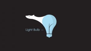


It’s like an optical illusion. When we look at the logo for the first time we either see a polar bear or we see a light bulb. However, eventually our brain finds the second “hidden” object. This little game that we play with the public allows us to remain in their memory. Because to assemble all the information in the design it’s necessary to take more than a quick glance at it. That’s why logos that play with negative and positive space, when well done, work so well.
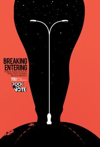
Lastly, here are some more examples of intelligent use of negative space:


Sorry, the comment form is closed at this time.