


For those who weren’t familiar, PANTONE is known worldwide as the standard language for color communication from designer to manufacturer to retailer to customer. The whole point of PANTONE standards is to ensure that we’ll get the color we desire through the print process.
That being said, every year PANTONE presents a new color. This works like setting a new color trend but not only. The institute wants the selected color to become an expression of a mood and attitude. We’re sure you’ll see it in everything around you. This year (2016), PANTONE established, for the first time, two colors of the year: the Serenity and Rose Quartz. But about about 2017?

Greenery – the color of the year 2017
Unlike the soft colors of 2016, this year PANTONE presents a new fresh color. Greenery is symbolic of new beginnings and symbolizes the reconnection with nature. Also, greenery represents the pursuit of personal passions and vitality. As PANTONE says:
Greenery is a fresh and zesty yellow-green shade that evokes the first days of spring when nature’s greens revive, restore and renew. Illustrative of flourishing foliage and the lushness of the great outdoors, the fortifying attributes of Greenery signals consumers to take a deep breath, oxygenate and reinvigorate.
So, PANTONE wants you to be fresh and ready for the next year. Be aware of clothes, objects and everything you can imagine. You’ll start to notice that Greenery is everywhere, and so does the Greenery mood. If you want to be the first to follow the trend, you can get some PANTONE products on their website, such as mugs, sketchbooks or USB drives.
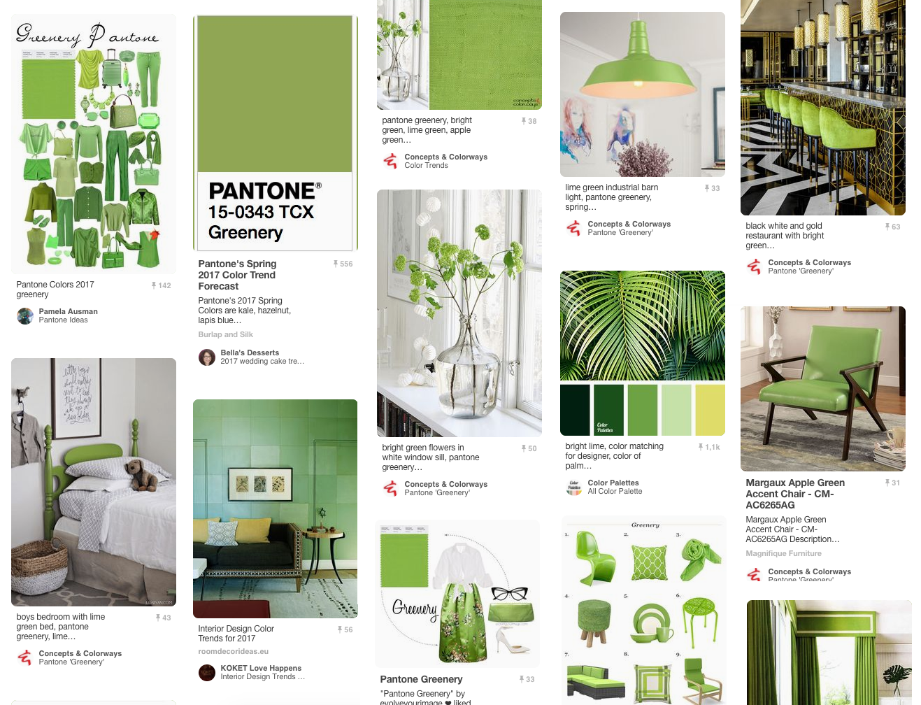
On Pinterest you can already find a lot of inspiration based on this new color for 2017. From fashion to home decor. Just be inspired with this wave of freshness and positivity.
In Portugal, we say that green is the color of hopefulness, and this meaning for Greenery makes all sense to us. Let’s taking off towards 2017!

Sorry, the comment form is closed at this time.